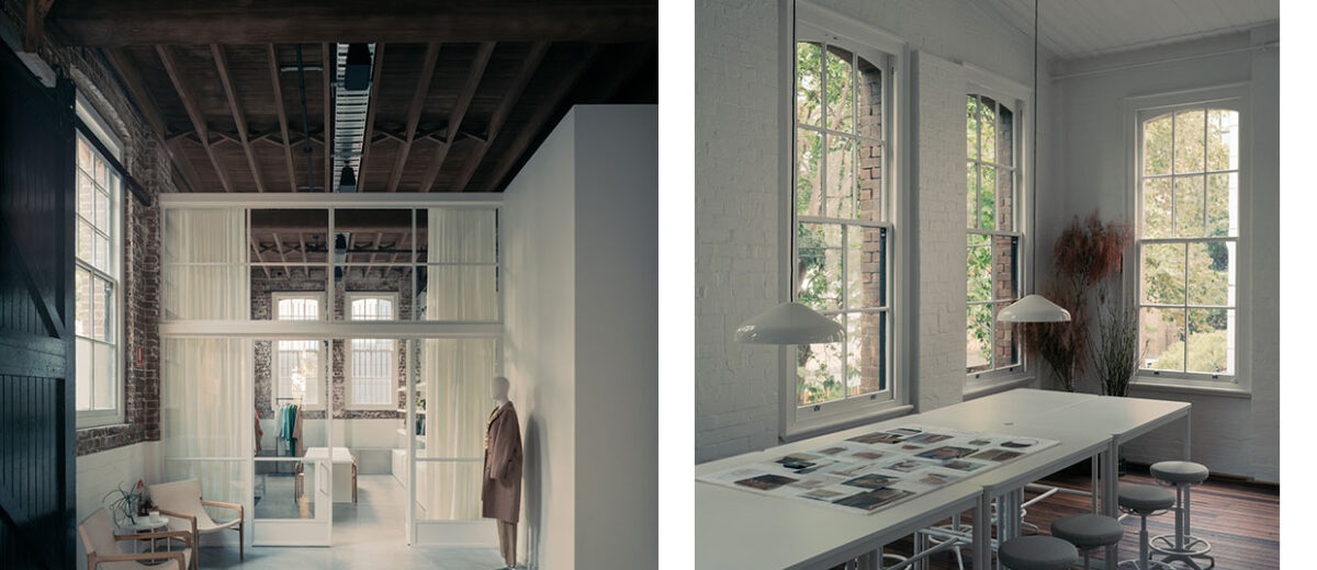


In one of Chippendale’s finest warehouses, Richards Stanisich imagines the new home for one of Australia’s most iconic fashion brands. Moving from their Milsons Point location, Oroton’s relocation marks a new, defining chapter for the brand. The interior celebrates the building’s past as a mechanic’s workshop set within the old industrial district, fused with the contemporary spirit of a classic fashion atelier.
Two main factors drove the vision for the new headquarters: the existing fabric of the magnificent brick heritage warehouse and the core principles of a fashion atelier — a house of inspired ideas and endless artistry.
“The grittiness of Chippendale is expressed within the Oroton warehouse,” says Director of Richards Stanisich, Jonathan Richards. “It feels very embedded in its context, a renowned historic fashion district of Sydney. The character of the area was paramount in the realisation of this project, overlayed with the elegance and sophistication of the Oroton identity.”
Instantly drawn to the building’s historic design elements, the team recognised the importance of architectural preservation and celebration of its past.


The existing fabric influenced every step of the process; it determined the quality of light, texture, space and volume and provided the backdrop for every detail throughout the office. The team’s response was to design with lightness, interweaving forms that don’t touch the ceiling or create any obstructions between activities.
The result is a working studio spanning three levels, each housing specific teams, workspaces and functions. At the entry is the Oroton display space — a sanctuary of colours, fabrics, garments and revered pieces from past, present and soon-to-be future collections. On the ground floor, set against the original brick walls and timber herringbone ceilings, are the administrative teams, the in-house photoshoot studio and the office kitchen. Level One is defined by double-height ceilings, light-toned walls, and an array of work zones for focused and collaborative work between the creative, design and marketing teams. Overlooking the middle floor is the mezzanine level, which houses the private board rooms and meeting areas.
Working with a historic site came with a few challenges. Due to its past as a mechanic workshop, the building was not compliant or suitable for a commercial office. Therefore, a significant part of the project included upgrading the site to ensure it met the standard building codes. The process involved levelling floors for equitable access, adding bathrooms and changing facilities, and installing a commercial lift, air-conditioning systems and sprinklers.


Richards Stanisich utilised a sensitive approach to colour inspired by the distinct palette of tones and textiles of the Oroton brand. Shades of dusty eucalypt green and light tan hues champion the space, complemented by soft whites and muted greys, allowing the existing bricks to shine through. The touches of eucalypt green act as a ribbon, which link all the interior elements together: the stair, balustrade and steel framed glazing.
“A big part of the Oroton concept was authenticity. We peeled the layers of the building back to expose the original brick and timber — the authentic structure and fabric,” adds Jonathan. “The interiors are showered in natural daylight and imbued with a joyous sense of space.”
In the last few years, the iconic brand has endured a renaissance across its creative endeavours, with the new headquarters signalling its continuous evolution. With this office, Richards Stanisich honours Oroton’s remarkable contribution to the Australian fashion landscape through its enduring identity and dedication to craft.
[Images courtesy of Richards Stanisich. Photography by Felix Forest.]


Envelope looks nicely finished, fitout seems crisp. I am sure they had a lot of structural difficulties to overcome, but IF some of the furniture is from IKEA that feels like a misstep.