


Of all the things we do here at Yellowtrace, one of the most amusing is having to regularly use Google Translate to decipher project descriptions and/ or read through submissions in broken-English. As a non-native English speaker myself, these texts warm my heart to no end, and sometimes I just feel like doing a good-old ‘copy and paste’ so you guys can enjoy it together with me.
Anyway. Tangent. But not really, because you know where I am going with this, don’t you?
Spanish architects Cristina Ansede and Alberto Quintáns of Ansede Quintáns have renovated an apartment in Vigo, Spain, and if you’re anything like me, chances are you had to google Vigo and its location. (I’ll spare you the trouble – it’s a coastal town located in Spain’s northwest, facing the Atlantic ocean, with a population just shy of 300,000 people).
When Ansede Quintáns took on the commission, the 1960s apartment had seen better days. “We were interested in conserving the environment, but once floors are changed and structures are reinforced, it is very difficult to catch those ghosts that one finds when entering these types of floors.” See what I mean? Totes adorbs. They continue to explain that this type of approach is “only possible when the reform is superficial finishes.”



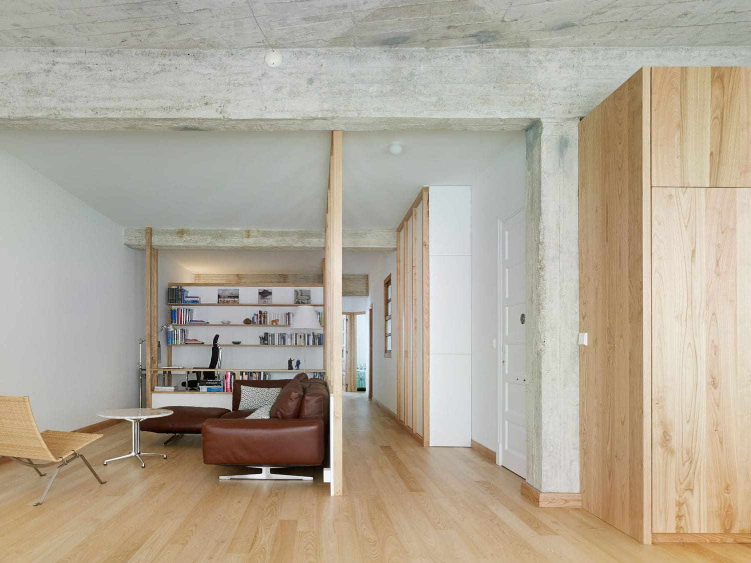
They decided to mainly stick with the original floor layout, and the partitions which were removed due to no longer being needed were kept as “skeletons”. Timber studs form notional screens that divide the living area from the entry corridor. “These structures that traverse the space without actually dividing it helped us to create different visual environments,” said Cristina and Alberto.
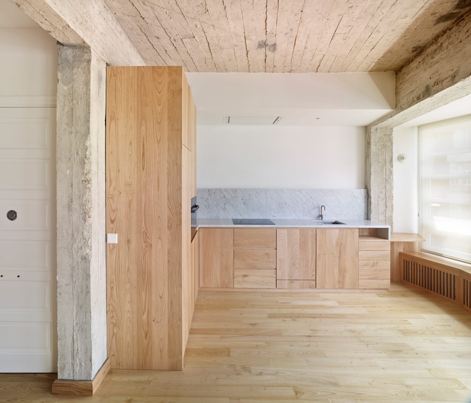
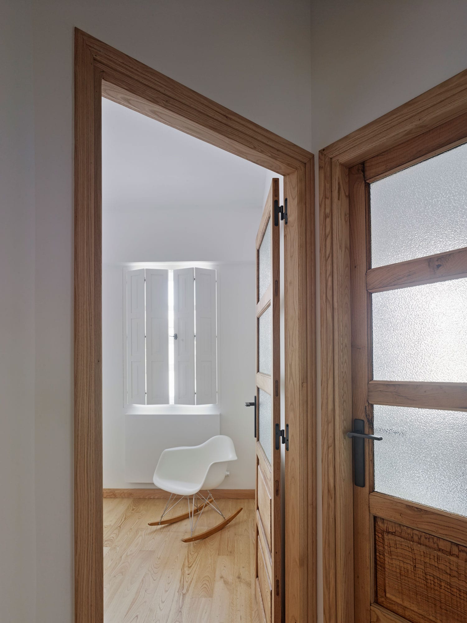
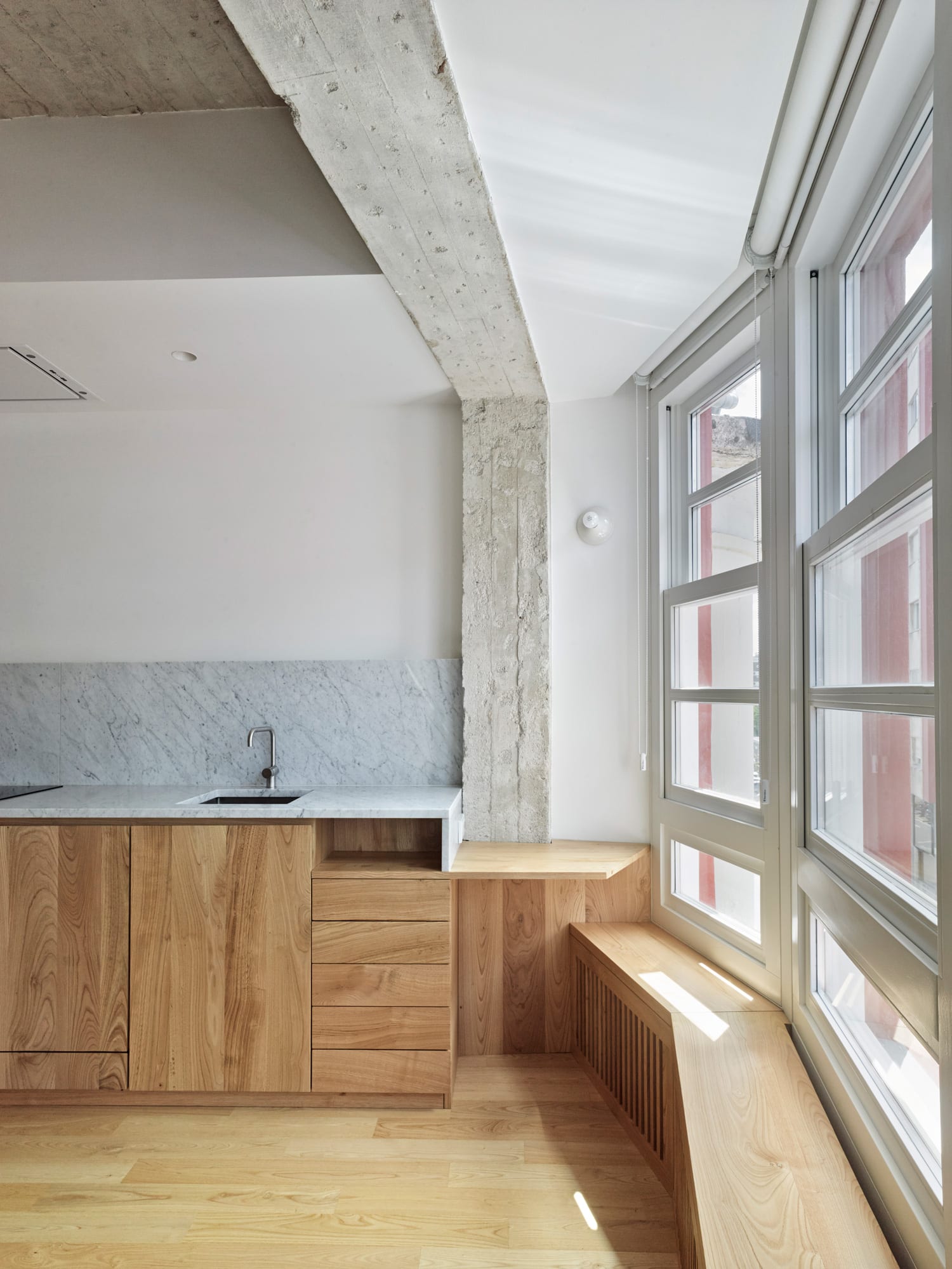
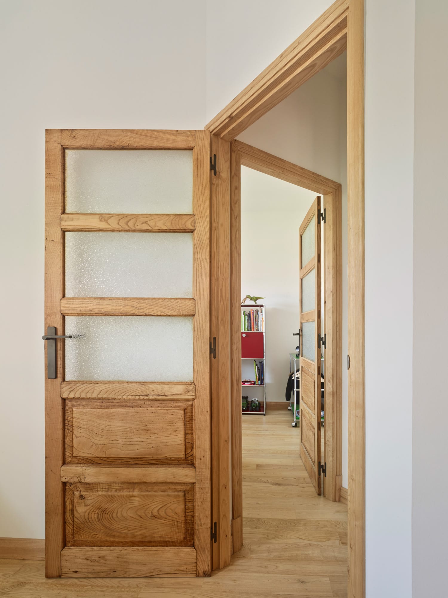
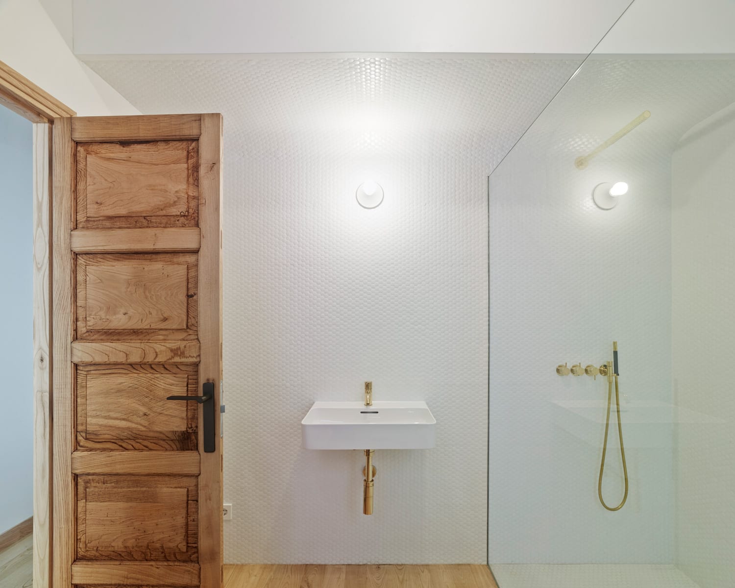
Ansede Quintáns went on to expose the original concrete ceilings, restore all original doors, and create a “timber gallery” made from original wall frames. “From there, the new materials are almost exclusively solid chestnut and lime plasters,” they said. Carrara marble was used as a counter for the kitchen, and white hexagonal wall mosaics in the bathroom. And that’s literally it.
“The result is a contemporary environment, in which we can still appreciate the traces of its previous state,” explain Cristina and Alberto. “We like to think that this is one more state of all that will come to have this property, and we think it’s nice to think that each intervention is something of the previous one that makes us recognise the age that it really has.”
Gorgeous. All of it.
[Images courtesy of Ansede Quintáns. Photography by Hector Santos.]






Leave a Reply